Friday, 23 April 2010

Editing the photos for the album artwork.

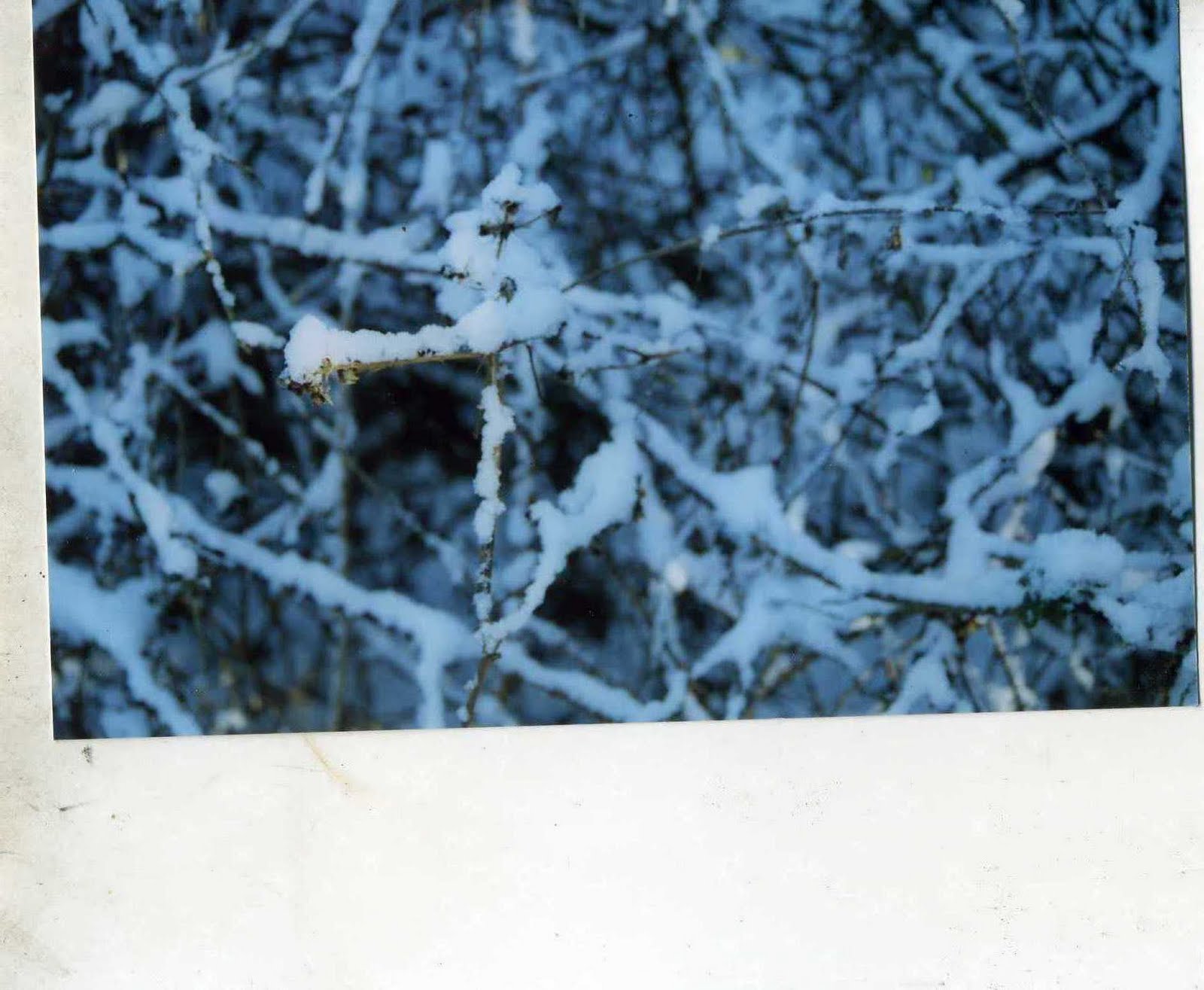
I noticed that on the images I scanned in, around the actual photo they is an almost dirty smudge like look to some sides of the framing which I thought looked good and made the photos look older.


I decided I wanted all of the white framing of the photos so be like this. So I edited them on Adobe Photo shop CS3 using the Clone tool so copy the colour of the parts I wanted and then copied them onto the other area of the image to make it look old and worn out. I used the burn tool on the framing of the photos making certain areas darker then others to make a bit of a contrast of colour. I also used the burn tool to put dark spots on to some of the photos to make them look old once again.


For the inside left photo, I used the blur tool to make the photo blurry, at first it was just to see how it would look like but I thought it was really fitting and followed the idea of the photos being old. I also used the burn tool to darken the sides of the photo to make it more grainy but it didn't make that much of a difference.
Original-

Edited-

With the chosen font, I needed to put the Musicians name, album title and song titles on it. I decided that since I couldn't use the name Bon Iver for my project, I would use my friends name, Simon Lowe, who acted for me, I thought this would still work as there are other musical artists who use their own name in most genres of music such as Chuck Ragan, Lilly Allen, Tegan and Sara and Micheal Jackson. I took the name of the album "Patient" from the "Skinny Love" song. To get the fonts on to the album covers, I opened the album cover and the font JPEGS files into Adobe Photo shop CS3. To get one image on to another I had to first make the font image a (layer), so I could then select the "Darken" option so the file no longer has the white space on the other image when placed upon it.


To get the Font image on to the album image, I used the "Move tool" to drag the font image onto the album image and decide where abouts I wanted the image to be. After that I used "Flatten Image" to make it a smaller file to save and make it "flat".

Final Font.

I decided to use the First font on the list from the post below. I found all the Fonts on the website www.dafonts.com . The one I have chosen is called "Honey i stole your jumper", I thought this one would work best as it looks handwritten and has soft curves and hard edges and I think my album artwork is similar.

Monday, 12 April 2010

Fonts.

I have been looking for possible fonts for my Music Magazine Advert and CD Artwork and found these which I think could work well.


Out of all of the fonts they is one that I'm not keen on and that one is the typewriting font. I don't think it would suit how the album artwork will look like and just think one of the other ones will will better.

Sunday, 11 April 2010

Possible Photos for CD Cover and Music Magazine.

These are the photos I took for my Music Magazine advert and my front cover. I decided that I didn't want to have any photos of Simon like in some other album covers and adverts. I want it just to be of the surroundings of the woods where I filmed it.

Front cover-


After looking at the images that I had planned to be my front cover, I decided that I didn't like the look of them and went off the idea. I remembered that during one of the days we filmed, I had some shot some colour film on an old Nikon Camera and forgotten that I developed the film. I found where I had left the printed film and then I thought the photos would work really well for my album cover. Instead of taking a photo of the photos digitaly, I scanned them in to the computer. I didnt put them in the scanner properly, so when the photo had been scanned, they came had a crooked frame around them which made me think of polaroids which made me think the photos would work even better for the album artwork.


Monday, 5 April 2010

Album cover and Magazine dafts.

These are my drafts for the Album covers and Music Magazine Advertisements.

Thursday, 1 April 2010

Editing process.

From the beginning of the project, editing was the one thing I was least looking forward to. After uploading all my footage and selecting the parts that I want, I started editing. I made sure I started editing along with the song so i could get the performance bits in sync so it would flow better and I could make the narrative scenes fit in as best as possible.

Monday, 29 March 2010

My plans for my Album cover and Music Magazine.

For my Music video I am also going to design and make an album cover, back and the insides of it and a full page advert for a Music Magazine.
For my Music Magazine Advert I plan on making a simple, A4 page advert. The way I see it in my head it would just have the album cover, the artists name, the album title and the realise date.
I am going to draw up some drafts for both album covers and music magazine adverts.