Thursday, 6 May 2010
Friday, 30 April 2010
Evaluation.
In what ways does your media product use, develop, or challenge forms and conventions of real media products?
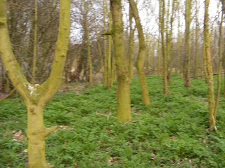
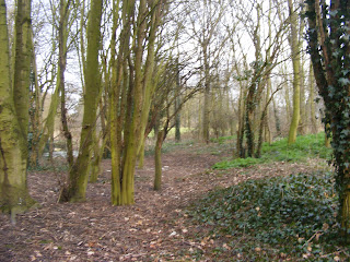
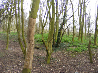
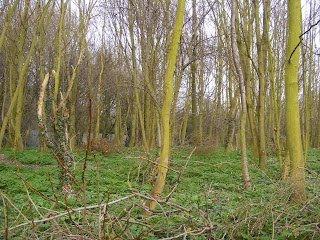
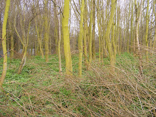
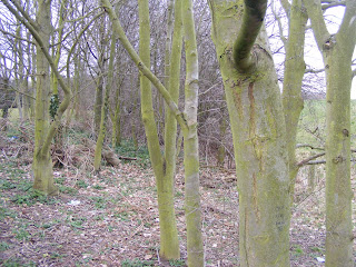
I don't think my product has challenged the forms and conventions of real media products. I wanted my music video to be simple and not push the boundies of the music scene as I wanted my music video to be like my chosen song, which isn't exciting or groundbreaking. It defiantly uses the conventions of the acoustic/folk music genre as I filmed it in a forest which is often the location of music videos of that genre. Bon Iver's music video for "The Wolves (act one and two) did influence me alot and helped me decide where I wanted to film it. My first idea of the location was going to be on a beach and the video would be similar to Coldplays "yellow" music video, But after visualising it I thought it would be boring so I Chose not to use that location. The other two locations I chose was a bed room because that's where relationships spend alot of time in and its a private place, and the other is a public park. I chose the public park as its a believable place where couples would meet up. My Music Video has both performance and narrative sequences which is conventional for music videos so I wasn't going against conventions in that way. The lyrics played a big part in what I chose for my narrative sequences. The song is about Relationships falling apart and breaking up, so I thought having the narrative scenes be about a relationship turning sour would be fitting as by listening to the lyrics the audience can almost make sense what the song is about and the narrative scenes which include the arguing between the couple, time apart from each other, and then the break up, enforces the lyrics which I like. I edited my music video knowing I didn't want any fast cuts or anything that would make the video confusing as they wouldn't fit with the tempo of the song. The song is slow and peaceful so if the music video had erratic cuts or anything that would go against the the tempo of the song wouldn't fit in the music video. The video is basically a story about a couple going through a rough time and then breaking up. Similar narratives have been used before but the couple would get back together and the video would end with happy ending, where as I used the lyrics as a strong relationship between the song and the video, so the lyrics caused what was going to happen in the narrative sequences. my music video was never going to end on a happy note, so in that way, my music video does challenge some conventions.
I don't think my music video would of developed any forms or conventions as everything in my music video isn't particularly original in the sense that something similar has been done before.
I think I made a Juxtaposition in my music video as the sequences where Simon is playing Guitar and Singing is peaceful, slow paced and slow cuts, where as in the sequences where Simon and His girlfriend are breaking up, its faster cuts, faster paced and due to the black and white filter I used, darker and harsher.I also used the black and white filter to reinforce the idea of it being a flashback, which is conventional of Music videos and Films.
I asked Simon to dress in a Checked shirt and jeans as I believe that in the acoustic/folk music genre, checked shirts and jeans have always been an image in that genre. Now, Checked shirts and jeans are very fashionable, so if my music video was a real, professional music video, the audience may want to look like the artist, or just simply like the look and imitate it that look.
For My CD artwork I had a brief idea of what I wanted but after taking the photos and putting them on to the CD layout, I decided that I didn't like the way it looked and wanted something else. When I found the photos I had taken on a 35MM colour film, I knew straight away that they would work. I think my album artwork is good and effective but I don't think It would of developed or challenged the conventions of the genre. I wanted to follow the conventions if anything as I wanted to make a music video that would appeal to the intended audience and people who may just stumble across it and then like it and then buy it. I didn't want the name of the artist to be massive and take up the whole front cover as I think the album artwork draws the customers in more then the artist sometimes. I think just having an interesting album cover can make people buy the album just because the may like the album artwork alot and want to see what the music is like, I myself have done that many of times. I purposely made the music magazine poster slightly ambiguous so that only the fans would recognise it and people who was liked the poster may take interest in the band and find them on Facebook or Myspace and listen to them, like them and then buy the CD from shops or online and then maybe go on to buy Merchandise.
How effective is the combination of your main product and ancillary texts?
I think the combination of my main product and ancillary texts work well as its like an on going theme from the Mise-en-scene of the music video being in a forest, on to the CD artwork and then onto the music magazine poster so its a motif. I think my CD album artwork and my Music magazine poster works together better as opposed to my music video.If I had planned my album artwork along side my music video, I would have maybe changed elements of my music video, for example I now think if I had edited the music perform ace scenes to look like an old withered effect like what you get on old, slightly expired film. I would of done this as I think that the CD, CD poster and the video would have more of a connection because of the "dirty stains" I edited onto the album artwork and poster.
I knew from the beginning I didn't want a photo of Simon in the album artwork or poster as I think when bands do that, they are trying to sell their image and appearance rather then their album. In Pop music, selling your image as well as your music is a convention and important where as I think in the Acoustic/Folk genre fashion isn't important.
What have you learned from your audience feedback?
For my audience feedback I found out and spotted things that I hadn't spotted otherwise. For example I hadn't really noticed some of the shaky camera work, this might of been because I had an attachment to it as I had put alot of time an thought in to it. I learnt to look at my work in a way I had no attachment to my work and be able to criticise it like it was somebody else's work. After I had edited it and watched it, I couldn't really pick out many parts that I didn't like and thought were bad, but after showing it to a number of people and they spotted certain aspects that they didn't like, then I read through the feedback, I then realised that what they had said was correct and if they wasn't in the video, my music video could be better.
I didn't set any question out for the audience to answer, I just asked them to write down a list of good things and bad things in my music video. I think this worked better as I may of set out questions that wouldn't of covered certain areas and I just think I got a more effective response from the audience by just asking them what they liked and didn't like.
After I got my audience feedback back and read through it, I think the response was mainly positive but some negative as well. Some of the positive feedback was that the video fits well with the song, the use of flash backs and editing them into black and white, some of the cinematography, having both narrative and performance sequences, the use of the fading in and out tool, the 1/2 second filler shots I used during the bridges of the songs, the locations used and the synchronization between the song and the performance.
The negative feedback included the shaky camera work, the acting, the ending shot where I pan the camera round to show Simon walking away could be better and that the fence in the background "disrupts the area".
I received mainly positive feedback about my two ancillary texts also. The audience liked the font I used as it "looks handwritten", the use of the photos and the way they look like old Polaroid photographs and the layout was liked as it was "simple and easy to follow".
My music magazine received some negative feedback. A few people from the research said that the posters main colour is to similar as the CD albums artwork even with the boarder around it, and because of the same colours, it looked slightly boring.
How did you use media technologies in the construction and research, planning and evaluation stages?
I used a wide range of new Media Technology in producing my music video and two ancillary texts which I either knew alot about and how to use them effectively like Adobe photo shop CS3, or not know how to use the programme at all and learn how to use the tools. To record the footage, I used a mini DV tape, after I had filmed it, I used a fire wire to upload the footage on to the computer, which is plugged into the Computer USB and the camera, I used the programme Matrox to capture it and Adobe Premiere to edit the footage.
I used Adobe Photoshop CS3 to manipulate my chosen images for my CD artwork and Album release poster. I picked to use this programme over Paint as you can do alot more with the images using Photoshop and its also the closest programme to professional editing programmes at college. As I had used Adobe Photoshop CS3 For my AS Media project, I already knew alot of the programmes and was comfortable using it effectively as possible. The tools I used to produce my CD artwork and music magazine poster are Crop, Move, clone, blur/sharpen/smudge and burn/dodge/sponge. To get the 35MM photos I used a Scanner so scan them in and make JPEG versions of them.
To edit and produce the footage I shot for my music video, I used Adobe Premiere. As I had never used this programme before, when I first opened the programme I was incredibly confused and didn't know where to begin. After finding the basics, and many attempts of trail and error, I became confident using the programme. I had a few attempts at it though as I didn't want to to settle with my first attempt so I kept re-editing my footage until I was happy with it. It took me a while to be happy with the outcome of it and that's why I re-edited it many times so I knew it was as good as I good make it. Tools I used to edit my music video are the Black & White filter, the fading effects and the razor tool to cut down the footage until I wanted a certain part of it.
When we was given this task, I picked two artists, Bon Iver and P.O.S that was a possibility for me to use them, so I used the Internet and YouTube to gather more information about them and to watch other music videos that they have to help me decide. After I decided that I was going to do Bon Iver-Skinny Love, I looked at artwork and other music videos in the Acoustic/Folk genre to give me Ideas and to help me understand the conventions of the genre.
I also used the Internet to to pick what font I was going to use.
I think that over all I have produced a fairly strong promotional package that if it was the real thing and professional, it would attract the intended audience. They are elements that if I had the opportunity I would change or improve. I think out of the music video and ancillary texts, my CD cover artwork is the strongest and most successful and my audience feedback said the same. I feel that now I have done this, I would be able to produce something similar to this for my own or a friends band as long as I had the needed software, hardware and the time.
Monday, 26 April 2010
Music Magazine Advert and Album Cover.

This is how I had imagined the Album cover to look when I imagined it. Its simple and it takes the page up which is how I wanted it and I can imagine seeing it in NME or Q magazine, which would be the magazine my intended audience would be aimed at.


These are the artwork I produced for my album.
Friday, 23 April 2010
Editing the photos for the album artwork.
I noticed that on the images I scanned in, around the actual photo they is an almost dirty smudge like look to some sides of the framing which I thought looked good and made the photos look older.

I decided I wanted all of the white framing of the photos so be like this. So I edited them on Adobe Photo shop CS3 using the Clone tool so copy the colour of the parts I wanted and then copied them onto the other area of the image to make it look old and worn out. I used the burn tool on the framing of the photos making certain areas darker then others to make a bit of a contrast of colour. I also used the burn tool to put dark spots on to some of the photos to make them look old once again.

For the inside left photo, I used the blur tool to make the photo blurry, at first it was just to see how it would look like but I thought it was really fitting and followed the idea of the photos being old. I also used the burn tool to darken the sides of the photo to make it more grainy but it didn't make that much of a difference.
Original-

Edited-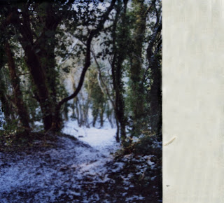
With the chosen font, I needed to put the Musicians name, album title and song titles on it. I decided that since I couldn't use the name Bon Iver for my project, I would use my friends name, Simon Lowe, who acted for me, I thought this would still work as there are other musical artists who use their own name in most genres of music such as Chuck Ragan, Lilly Allen, Tegan and Sara and Micheal Jackson. I took the name of the album "Patient" from the "Skinny Love" song. To get the fonts on to the album covers, I opened the album cover and the font JPEGS files into Adobe Photo shop CS3. To get one image on to another I had to first make the font image a (layer), so I could then select the "Darken" option so the file no longer has the white space on the other image when placed upon it.
To get the Font image on to the album image, I used the "Move tool" to drag the font image onto the album image and decide where abouts I wanted the image to be. After that I used "Flatten Image" to make it a smaller file to save and make it "flat".

I decided I wanted all of the white framing of the photos so be like this. So I edited them on Adobe Photo shop CS3 using the Clone tool so copy the colour of the parts I wanted and then copied them onto the other area of the image to make it look old and worn out. I used the burn tool on the framing of the photos making certain areas darker then others to make a bit of a contrast of colour. I also used the burn tool to put dark spots on to some of the photos to make them look old once again.

For the inside left photo, I used the blur tool to make the photo blurry, at first it was just to see how it would look like but I thought it was really fitting and followed the idea of the photos being old. I also used the burn tool to darken the sides of the photo to make it more grainy but it didn't make that much of a difference.
Original-

Edited-

With the chosen font, I needed to put the Musicians name, album title and song titles on it. I decided that since I couldn't use the name Bon Iver for my project, I would use my friends name, Simon Lowe, who acted for me, I thought this would still work as there are other musical artists who use their own name in most genres of music such as Chuck Ragan, Lilly Allen, Tegan and Sara and Micheal Jackson. I took the name of the album "Patient" from the "Skinny Love" song. To get the fonts on to the album covers, I opened the album cover and the font JPEGS files into Adobe Photo shop CS3. To get one image on to another I had to first make the font image a (layer),
 so I could then select the "Darken" option so the file no longer has the white space on the other image when placed upon it.
To get the Font image on to the album image, I used the "Move tool" to drag the font image onto the album image and decide where abouts I wanted the image to be. After that I used "Flatten Image" to make it a smaller file to save and make it "flat".
Final Font.
I decided to use the First font on the list from the post below. I found all the Fonts on the website www.dafonts.com . The one I have chosen is called "Honey i stole your jumper", I thought this one would work best as it looks handwritten and has soft curves and hard edges and I think my album artwork is similar.
Monday, 12 April 2010
Fonts.
I have been looking for possible fonts for my Music Magazine Advert and CD Artwork and found these which I think could work well.


Out of all of the fonts they is one that I'm not keen on and that one is the typewriting font. I don't think it would suit how the album artwork will look like and just think one of the other ones will will better.


Out of all of the fonts they is one that I'm not keen on and that one is the typewriting font. I don't think it would suit how the album artwork will look like and just think one of the other ones will will better.
Sunday, 11 April 2010
Possible Photos for CD Cover and Music Magazine.
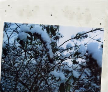
These are the photos I took for my Music Magazine advert and my front cover. I decided that I didn't want to have any photos of Simon like in some other album covers and adverts. I want it just to be of the surroundings of the woods where I filmed it.
Front cover-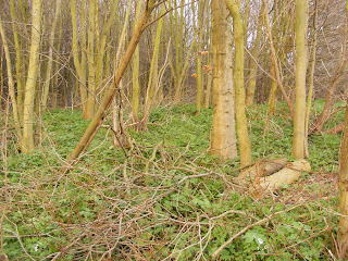


After looking at the images that I had planned to be my front cover, I decided that I didn't like the look of them and went off the idea. I remembered that during one of the days we filmed, I had some shot some colour film on an old Nikon Camera and forgotten that I developed the film. I found where I had left the printed film and then I thought the photos would work really well for my album cover. Instead of taking a photo of the photos digitaly, I scanned them in to the computer. I didnt put them in the scanner properly, so when the photo had been scanned, they came had a crooked frame around them which made me think of polaroids which made me think the photos would work even better for the album artwork.


Monday, 5 April 2010
Album cover and Magazine dafts.
These are my drafts for the Album covers and Music Magazine Advertisements.
Thursday, 1 April 2010
Editing process.
From the beginning of the project, editing was the one thing I was least looking forward to. After uploading all my footage and selecting the parts that I want, I started editing. I made sure I started editing along with the song so i could get the performance bits in sync so it would flow better and I could make the narrative scenes fit in as best as possible.
Monday, 29 March 2010
My plans for my Album cover and Music Magazine.
For my Music video I am also going to design and make an album cover, back and the insides of it and a full page advert for a Music Magazine.
For my Music Magazine Advert I plan on making a simple, A4 page advert. The way I see it in my head it would just have the album cover, the artists name, the album title and the realise date.
I am going to draw up some drafts for both album covers and music magazine adverts.
For my Music Magazine Advert I plan on making a simple, A4 page advert. The way I see it in my head it would just have the album cover, the artists name, the album title and the realise date.
I am going to draw up some drafts for both album covers and music magazine adverts.
Monday, 1 March 2010
Health and Safety.
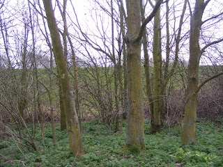
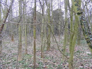
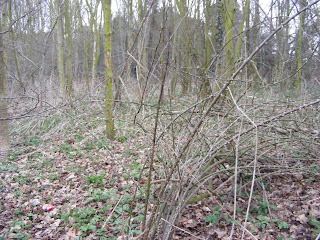
As I will be filming in a forest, Roots sticking out the ground may cause myself or Simon to trip and broken glass. After checking the area for possible dangers to us, and it made sure it was safe, we started filming.
Monday, 28 December 2009
LIIAR.
lIIAR.
Language- This is Would be the use of cinematography, editing, mise-en-scene and sound. Also includes any elements of narrative structure and genre.
Institution- Is would be the Record company that put out the album (Jagjaguwar/4AD)or the Music video Director.
Ideology- The Ideology is of the Record companies and the band and if they are mainstream or indie, their values, promoting techniques, what they stand for as a band who and how they target their intented audience.
Audience- My Target audience is between the age between 16 and 40 as they have quite a mature sound.
Representation- Representation is how the band dresses, acts and their beleifs and their fans tend to follow suit.
Audience research.
The target audience would be to the age groups of teenagers from ages seventeen to twenty one to adults aged between thirty and forty. Bon Iver wrote a new song for twilight two, this may of caused the bands audience age to open more as young girls who like twilight, would like the soundtrack, meaning they may like the Bon Iver song so they might want to listening to the bands other material.
Similar bands to Bon Iver's genre are Justin Vernon (the writer for Bon Iver), Fleet Foxes, Mumford and Sons, Iron and Wine and Rumbleseat, people fans of the indie/folk/acoustic genre will defiantly like Bon Iver. Magazines they will read will be magazines like NME.
Bon Iver's lyrics are mainly about relationships and heartbreak, people who can relate to those feelings or have gone through those feelings, will like Bon Iver.
Thursday, 17 December 2009
History of music videos.
Information taken from Wikipedia-
http://en.wikipedia.org/wiki/Music_video
A music video purpose is to advertise the band/singer and add as another type of "promo" for the band. Music videos is a short film which may include a narrative story which tends to reflect back on to the lyrics of the song and usually shows the band/singer performing the song, maybe to a live crowd. Music videos came into popular use in the early 1980's, but but the use of music videos go back well before then.
Music videos can include many different styles and techniques in the actual video side to it, animation, live action filming( humans acting it out), documentary style, abstract music videos are really just videos with no narrative. Some videos have combined styles.
Thursday, 3 December 2009
New Ideas and Animatric.
Instead of filming the performance bits in Simon's Bedroom, I'm going to film the same the same thing but in a near by forest. I have decided to do this as I have taken influence from the "For Emma, Forever ago" CD cover. The narrative parts I thought that if it was clear to the audience it was a memory of Simon, and I would do this by editing them into black and white, the narrative would be stronger and make sense, it would relate to the lyrics even more so aswell. I plan on editing the sequences into black and white to re-enforce this is a memory and wasnt a happy time.
Wednesday, 18 November 2009
Props, actors, location.
Props- Guitar, Teddys and mobile phones.
Actors- Simon (The boy in the narrative and playing/singing to the song) and Laura (Girl in narrative).
Locations- Simons bedroom(the parts where Simon will be playing guitar and singing the song), Lauras bedroom/house and a park.
Actors- Simon (The boy in the narrative and playing/singing to the song) and Laura (Girl in narrative).
Locations- Simons bedroom(the parts where Simon will be playing guitar and singing the song), Lauras bedroom/house and a park.
Thursday, 5 November 2009
What I need to do next.
Now I have got my idea almost planned, I am going to start drawing my storyboard to help me progress. I am going to decide how and when I am going to change from the narrative stucture to parts were he is performing or just playing and singing. I had an idea that he would be recording, if I use this, I will use the college recording studio.
Wednesday, 28 October 2009
Idea Change.
After thinking about and watching the video for "Yellow" by Cold play, I compared my original idea with the video, and realised it would be almost the same video just a different song. I have decided to put a narrative storyline within the music video. Since the song is about love going sour and relationships breaking up, I am going to ask two friends, boy and girl, is they would act like a couple having an argument and then walk away from each other. I am also going to get my friend who was going to do be in my original video, to once again Micky mouse the lyrics and play along to the song on guitar, since he is a talented guitarist, he will actually be able to play the song, giving it more authenticity. I am still to decide weather I am going to use the beach idea, I think it would still work, but not by itself as it would be to similar like i said and boring.
Tuesday, 20 October 2009
Conventions expected in music videos.
Because they are so many music genres, every music video includes different styles and characteristics, It all depends on what genre the band/artist play. If its a slow song, the camera work and and editing may be done in a way to reinforce the slow song, where as if the song has a fast tempo, the editing and camera work will be done in the opposite way. The mood and meaning of a song can also have a huge affect on how the music video may be produced. Most music videos are mixed with narrative and performance parts.
Cinematography- causes a big impact on meaning. Movement, distance and angle both play a part in representation of the band/artist.
Editing- the most common form is fast-cut montage, rendering many of the images impossible to grasp on first viewing, so ensuring multiple viewing. Often enhancing the editing are digital effects, which play with the original images to offer different kinds of pleasure for the audience. Editing is often set to the tempo of the musics beats and rhythm
Mise En Scene- is everything in the scene, so everything important and necessary will be showed in the scene or sequence to show narrative structure, or just the band/artist performing.
Narrative/performance- Most music videos have some form of narrative structure within the video, the narrative usually reflects back on to the lyrics of the song to reinforce the meaning and representation.
Representation- in music videos, representation of gender, stereotypes, age, social class are an important factor of music videos. Even the band members are representation something.
Genre- should be reflected in types of mise-en-scene, themes, performance, camera and editing styles.
Symbolic codes are used also, symbols used may not have an obvious meaning unless you know what it means, then it will make sense.
Wednesday, 14 October 2009
Analyis of Bon Iver video and two other videos of the same genre.
tBon Iver-the Wolves (act one and two)
Bon Iver only has one official music video for the song The Wolves (Act I and II).
So I am going to Analise that video. In the video, there isn't a narrative structure or footage of the band playing or performing. The Music Video has been shot in a forest. I don't think there is anything in the video which relates to the lyrics. I am assuming that the forest in which it is filmed in, is the same place where the album was recorded. I don't think the music video has any particular mood, the and video are neutral in my opinion. Some of the shots used in the video are almost like still images as the camera doesn't move a lot, the shots don't show a lot either. A lot of the footage used is almost amateur in the style it has been filmed. Shots used are: Medium shots, long shots, extreme close ups, close ups and wide shots. Angles used are mid angles, low and high. From about 3:52 to 4:14 the editing is a lot faster and sharper from scene to scene to the rest of video, it seems to be in sequence to the music.
City & Colour-Waiting.
In this video, it shows the band, playing and singing to the song "waiting". The song is about becoming depressed and how people sometimes forget who important and short life is. It has been edited into black and white, I think this has been done to reinforce the lyrics about depression. it shows Dallas Green, who writes all of the music, and is also named after himself but not obviously, Dallas is state in America and his last name, green, is a colour, playing different instruments from acoustic guitar which is the rhythm, electric guitar which is the lead and the piano. for the first 10 seconds the camera is on a stand of some kind pointing down and framing Dallas Green on the right side of it, this shot is a medium shot of him. The following shot is of the piano he later uses. Within the mise en scene, guitars that aren't even used and amps are in the shot. single shots of the instruments make a montage. During the editing process, from the light bulbs and lights, a line of the light has been dragged in the direction the camera is moving. The first time you see this happen is 1:39 into the video, you also see it again at 2:16 but just as its leaving the framing, the drummer hits the drum kit which then makes the light line move, which I think it looks like a heart rate monitor. you see it a few more times,but at 3:02, Dallas Green is stood in the centre of four light monitors which then light lines seem to grow out of them, then making what looks like a piece of unwritten classical music notation.
Jack Johnson-Breakdown
This song is about stopping and realising what is around that you wouldn't normally see otherwise, taking in and noticing real beauty in your surroundings. In the video it shows Jack Johnson doing the things he love, which are surfboarding and music and shows other scenes recorded which weren't perhaps recorded for the music video, but still works well. Camera shots used are long shots, close ups, medium shots, extreme long shots,There is no narrative structure to the video. most of the footage has been filmed on location of Pichilemu, Chilean which is a famous area for surfers.
Subscribe to:
Posts (Atom)